
Voilà, the poster/postcard design for the February/March 2016 showcase run of “Speakeasy – John and Jane’s Adventures in the Wonderland”!
Designed by Derk Scholtz in an ever evolving process that I will get into more behind-the-scenes detail below. But first, let me reveal that this is not the only Speakeasy postcard/poster image. There will be a twin, in more ways that one. There is a “sister” design to compliment the “brother” design. Continue on for the reveal:

Those of you following the blog who have eagle eyes and keen memories may recognize the historical vaudeville act “Dolly Sisters” in the above design, as a female compliment to the two Harlem men dancing slow in the upper version.
 Derk Scholtz and I go way back to high school in Berlin, Germany. He designed the poster art for my first musical “Once Upon a Frog”. Later he would also design the poster art for my Mark Twain musical “beTwixt, beTween & beTWAIN”. It felt natural to approach him about coming up with possible designs for “Speakeasy”.
 My original idea was a trio of designs. One that showed Jane Allison going “down the rabbit hole” by running after Roberta White down an alley basement staircase into a Speakeasy secret entrance. One that showed John Allison midway through sliding “through the looking glass” mirror in the public restroom. One that showed Chet Cheshire in mid “appearance” or mid “disappearance” as he welcomes the viewer into the world of the Wonderland with wide smile and top hat and gloved hands.
For now we put the first two design ideas on hold and focused on the Chet Cheshire idea first. I had asked Derk to be inspired in part by the cartoon images we found in 1920’s and 1930’s editions of The New Yorker magazine. This produced this early design draft:


The Cheshire Cat confounds the King and Queen
Our director Lissa pointed out that there was little in the design to connect the image with Lewis Carroll’s Wonderland. A viewer might recognize an allusion to Old Time-y entertainers, but no more than that. No Lewis Carroll or Wonderland, in the image at least. How could we tell the audience in an image that this wasn’t a generic 1920’s M.C. type, but one based on the Cheshire Cat, with all the Wonderland mystique, weirdness and cleverness that entails? Lissa suggested basing the head on John Tenniel’s original artwork the Cheshire Cat.
That line of thought led to this draft:

We were pretty happy with that. The design worked well. But as we kept discussing it, we worried that it may still be too “family friendly”, not indicating the somewhat mature sexual content, the exploration of 1920’s Queer subculture that informs the musical. Our P.R. Representative Paul Siebold wondered whether it would be possible to include some of the vintage photographs I had been posting on Notes from a Composer every time I wrote about Speakeasy and its historical context.
We batted about some ideas with Derk and finally settled on using this favorite photo:

Derk used the left part of the photo with the two closely dancing men as the “wallpaper” above which the Chet Cheshire floats. The background image becomes the reference to both the era and the queer content.
Derk sent us this preliminary test:

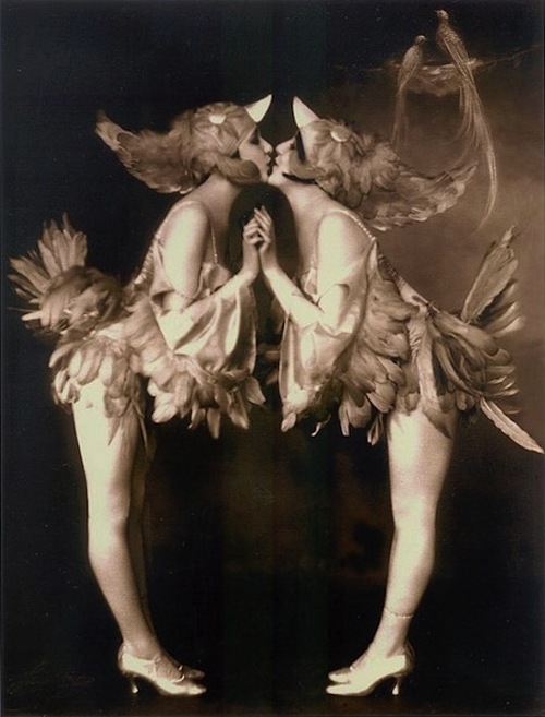
We loved where this was heading, but also realized that we would want a same sex female counterpart to the same sex male version we were creating. Who else to look to for photographic sapphic undercurrents than the Roaring Twenties’ celebrated vaudeville act The Dolly Sisters, models for Speakeasy’s own Tweedle Sisters. My favorite picture of them has graced our Kickstarter campaign page this past month:

But the distance between the Dolly Sisters’ heads would make this image not work well as the female equivalent to the homoerotic wallpaper idea. Luckily an equally swell Dolly Sister picture brings their lips close together, in funny bird costumes no less:
And there we have it. Our two Speakeasy postcard/poster designs! I hope you like them!


2 great posters c.and A.
LikeLike